HAMMER
Handwerk
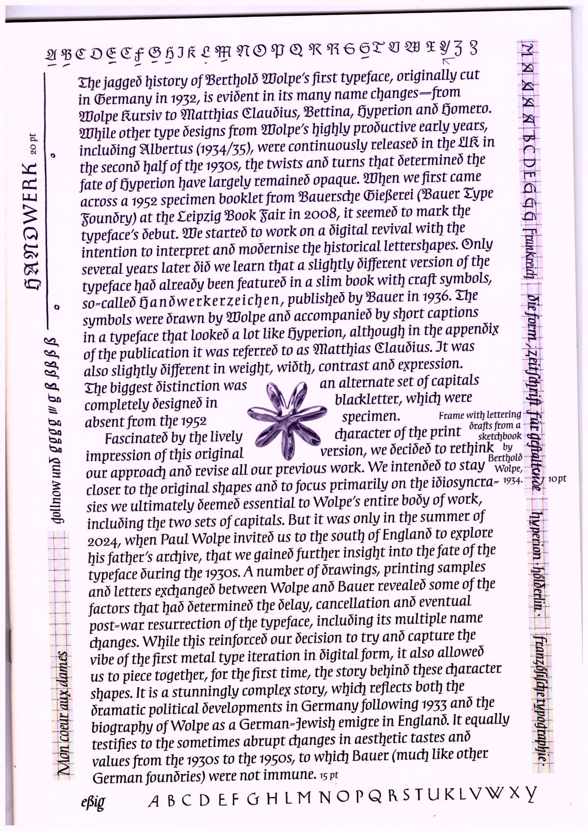
Berthold Wolpe’s (1905–1989) first typeface, originally cut in Germany in 1932, underwent numerous name changes, from Wolpe Rursiv to Hyperion. While other designs by the typographer, such as Albertus, found success early, Hyperion’s path remained obscure. A 1952 specimen seemed to be its debut, until earlier traces from 1936 emerged, including blackletter capitals and a different name – Matthias Claudius – a discovery that led to a revision and digital revival, honouring Wolpe’s original vision. [publishers’ note]
“Deviating from the 1952 approach, our digital iteration aims to restore the charmingly uneven rhythm of Wolpe’s hand-lettering style. ... We refined each glyph by avoiding straight lines whenever possible. Combined with capitals rooted in classic Roman alphabets, the typeface now morphs between rustic and elegant, creating a contemporary, at times mystical impression. At the same time we intended to make the complex history of these character shapes transparent, by adding two stylistic sets. One set refers to the streamlined 1952 iteration, and the other includes the blackletter capitals, which are part of a publicly available version of this typeface for the very first time. … As a nod to the earliest version of the typeface and a tribute to Wolpe’s hands-on approach, shaped by his background in metalworking, we take the liberty of adding another entry to the long list of names that have accompanied the typeface: Handwerk.”
—David Schatz, Philipp Herrmann & Sereina Rothenberger
Published by Rollo Press, 2025
Design by Rietlanden Women’s Office
Typography / Specimen
